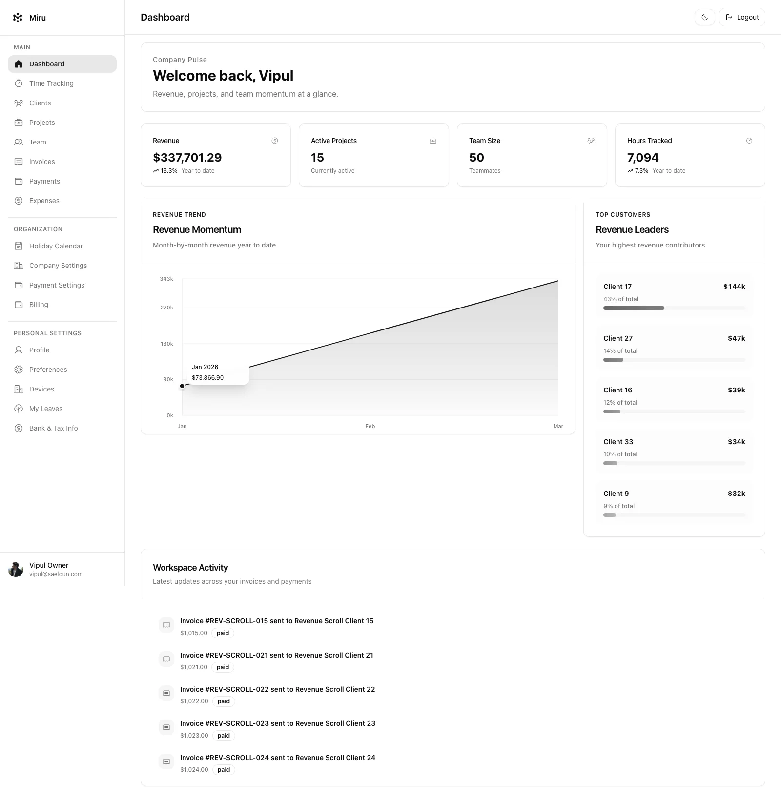
The Toastr component displays temporary success or error notifications.
Importing the Toastr Component
To use the Toastr component in our app, we need to import it from our styled components. Here’s how we can import it:
import { Toastr } from "StyledComponents";Using the Toastr Component
The Toastr component can be used with various props to control its appearance. Here are some examples of how we can use it:
Success message toastr
Toastr.success("Pass the message to be displayed");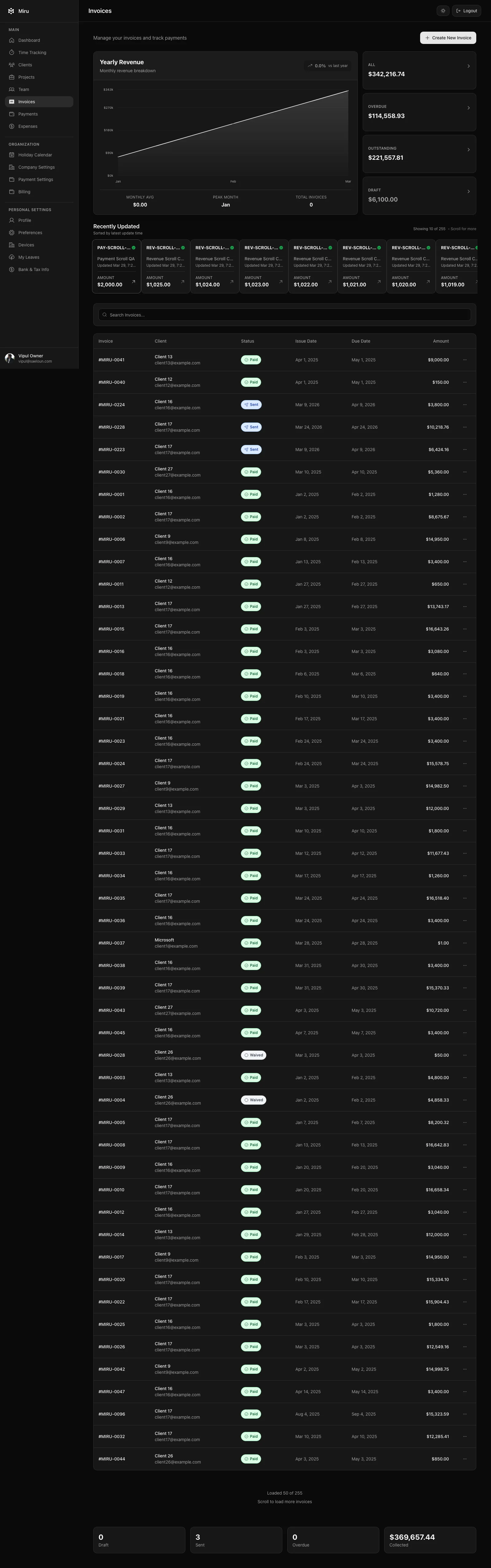
Error message toastr
Toastr.error("Pass the message to be displayed");