The Tooltip component shows additional context when a user hovers over or interacts with an element.
Importing the Tooltip Component
To use the Tooltip component in our app, we need to import it from our styled components. Here’s how we can import it:
import { Tooltip } from "StyledComponents";Using the Tooltip Component
The Tooltip component can be used with various props to control its appearance. Here are some examples of how we can use it:
<Tooltip
  content="Send To"
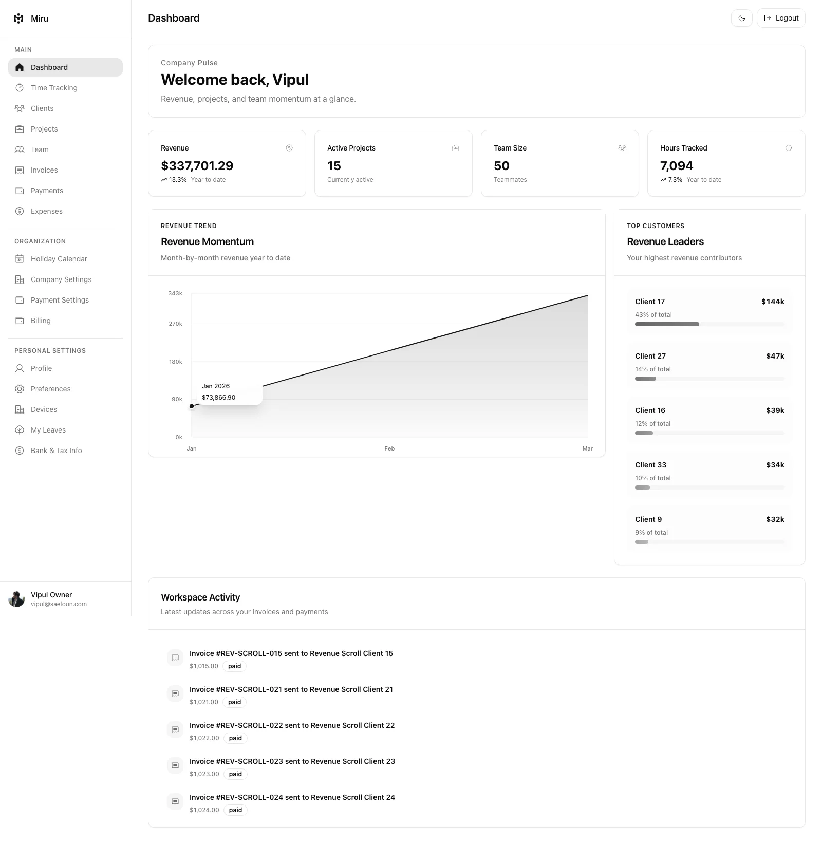
>
<Tooltip
  className="tooltip tootlip-project px-3 py-2"
  content="Add/Remove Team Members"
>
<Tooltip
  placeBottom
  className="tooltip tootlip-project px-3 py-2"
  content="Add/Remove Team Members"
>
Tooltip Component Props
| Name | Description | Default Value |
|---|---|---|
content | The content to be rendered inside the popup. string | - |
placeBottom | To specify the position of the Tooltip. by default it is placed on top of children component. bool | false |
show | To specify whether to show Tooltip or not. bool | true |
delay | To display the Tooltip after n-milliseconds. number | 400 |
className | Specify the extra style classes needed for content of Tooltip string | - |
wrapperClassName | Specify the extra style classes needed for Tooltip component string | - |
children | Tooltip popup will be shown when mouse is hovered over this component. node | - |